|
|
Post by Partridge on Sept 9, 2014 22:27:54 GMT -5
|
|
|
|
Post by Richard W on Sept 10, 2014 8:47:40 GMT -5
Enjoyed that, Tony.
Watching this, and watching the dates go by, you have to shake your head in wonder at the sheer effort Linda put into her '70s career starting with Don't Cry Now ('73): an album every year right up through Living in the USA ('78), with subsequent tours for each album. And excellent albums they were.
And thanks for that infamous Pickwick cover, where the designer made Linda look like Judy in Punch and Judy. Someone should have pummeled him/her with a brickbat!
|
|
|
|
Post by erik on Sept 10, 2014 9:27:15 GMT -5
Quote by Richard w re. Stoney End cover:
Yes, that one was a true atrocity (IMHO).
|
|
|
|
Post by fabtastique on Sept 10, 2014 9:43:11 GMT -5
nice work!
|
|
|
|
Post by Tony on Sept 10, 2014 11:02:47 GMT -5
I will go back and put the Stone Poneys albums at the beginning, and after the regular releases, show the compilations and greatest hits albums.
|
|
|
|
Post by simpledream on Sept 11, 2014 23:32:01 GMT -5
great work tony. we are fortunate to have a top curator such as yourself.
|
|
|
|
Post by eddiejinnj on Sept 12, 2014 6:17:07 GMT -5
you can just feel the love!!!!! he da man!!!!! eddiejinnj
|
|
|
|
Post by sliderocker on Sept 12, 2014 14:08:29 GMT -5
Quote by Richard w re. Stoney End cover: Yes, that one was a true atrocity (IMHO). Even though it's one of my favorite albums (and could rightly be called a greatest hits album), I didn't much care for the front cover artwork for "Different Drum." The drawing also made the album look like a Pickwick budget album. It was better than the Pickwick cover, no question about that but if you're going to use a drawing of the artist, why not one that is very tasteful and pleasing to the eye? But, to be honest, I don't much care for most of the artwork of the various "Best of..."/"Greatest Hits" albums either. All could've been better. The worst offender was Capitol's two-LP set, "A Retrospective, whose inner sleeves looked better than the front and back covers. Like "Different Drum," it was a good album to get some of Linda's early recordings as a solo artist and some of the Stone Poney recordings that Capitol had deleted and not reissued when Linda achieved superstardom. As for Pickwick and their hideous drawing, well, they did that with other artists as well but there were a few albums that didn't even have a drawing of the artist. I suspect that as a budget record company whose titles were generally between two and three dollars, they probably would had to have paid extra to use some photos. And that probably would've raised the price of the album in question. |
|
|
|
Post by kgreen on Sept 14, 2014 8:11:42 GMT -5
Nice work Tony. Which program did you use? Flash? HTML.
|
|
|
|
Post by Partridge on Sept 14, 2014 14:38:17 GMT -5
The page is coded in html. I write it out by hand- I don't use any tools. That's why I don't have a lot of fancy effects on the website. I should change that. I decided some of the photos of the album covers could be improved, so I opened up the glass doors on my bookshelf and you can see below what came tumbling down to the floor. This mirror was in mint condition for 38 years but I think it is now beyond repair: 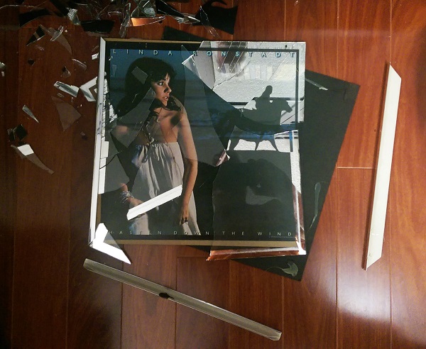 |
|
|
|
Post by Dianna on Sept 14, 2014 14:59:20 GMT -5
yikes... beyond repair.. reminds me of a 1 of a kind 1920's candelabra lamp I won on ebay.. the seller did not pack it well and that's how it arrived. like your broken Linda.
|
|


